Introducing Dark Mode
17.7.2020

What are the benefits and how do you turn it on?
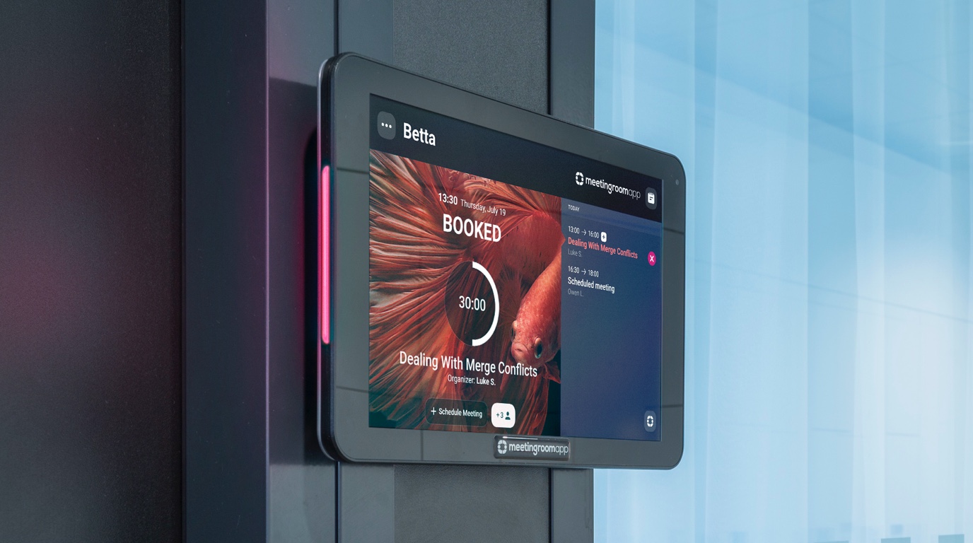
The new Dark Mode feature brings a whole new look of our scheduling system, darkening the interface across the app. Play around with font colors to create a unique look of your app.

Not only does the Dark Mode look just great, it’s also easier on the eyes and helps reduce eye strain. It prolongs the lifetime of some OLED display batteries and the reduced brightness can actually have a positive impact on the display itself. We’ve tested the dark theme on a variety of devices in a number of offices and the results are straightforward: the dark theme looks stylish and trendy.
How do you set your room schedule display to Dark Mode?
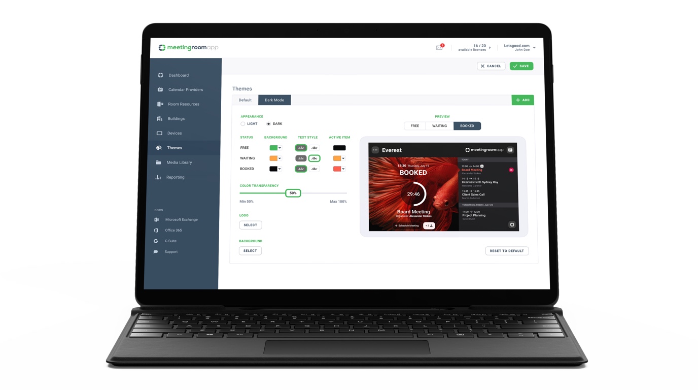
You can customize the appearance of your app on iPad and Android devices on the Themes tab of your Cloud account. There are two themes to choose from in the default settings. To apply the dark theme, simply click the ‘Dark’ option.

What other changes can you make to customize the app’s appearance?
The Dark Mode is a part of our program to customize the design of MeetingRoomApp, which we’re launching this year. Get inspired by the tips in our article How to Change the Appearance of Your Room Schedule Displays with detailed instructions on how to customize and enhance your app experience.